Frederic Brodbeck
Frederic Brodbeck — Super Simple Sites
Media Minimalism — Winter 2019
———
Summary
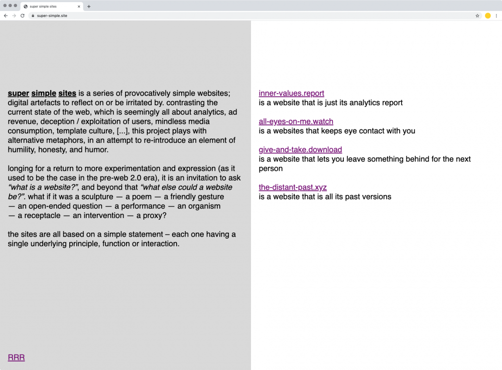
Super Simple Sites is a series of provocatively simple websites; digital artefacts to reflect on or be irritated by. Contrasting the current state of the web, which is seemingly all about analytics, ad revenue, deception / exploitation of users, mindless media consumption, template culture, [...], this project plays with alternative metaphors, in an attempt to re-introduce an element of humility, honesty, and humor.
Longing for a return to more experimentation and expression (as it used to be the case in the pre-web 2.0 era), it is an invitation to ask “What is a website?”, and beyond that “What else could a website be?”. What if it was a sculpture — a poem — a friendly gesture — an open-ended question — a performance — an organism — a receptacle — an intervention — a proxy?
The sites are all based on a simple statement – each one having a single underlying principle, function or interaction.
———
Long description
As someone who has done a lot of work for and with the web, I am aware of the fact, that it has changed a lot over the year – and not necessarily for the better. when I was young, I participated in the web by making naïve little websites; mostly for myself. Now, in hindsight, I like to think of it as 'understanding the web through making it'.
since then, the internet has 'grown up'. What used to feel like a 'wild west' space, that was new to everyone at the time, and therefore in a constant state of experimentation and transformation, almost inevitably became more serious, and more and more defined by capitalist interests. As a consequence of this process of commodification, the web slowly became subject to more regulation and locked down. Commercialization of the online space has led to very exploitative practices towards users, with things like analytics, tracking, and aggressive data collection essentially making the user a product, or even a resource. Big platforms started owning people's content, usually without them even being aware of it. Obscured by overly complex EULAs, and outwardly portraying themselves as social platforms, more and more sites started deceiving their audience, while at the same time locking them in. Additionally so-called dark patterns, actively try to nudge users into behaviors, that are beneficial to the platforms' interests. On the design side template culture has led to big parts of the landscape looking almost identical and interchangeable. — This is just to name a few. Obviously there is more, and naturally there are also positive aspects, but this is mainly criticizing the more dubious parts.
I am certainly not the only one who is trying to imagine what the future of the web could look like; or an alternative web altogether. As part of this, one of the things I personally find interesting to think about is what a website actually is – or rather – what else a website could potentially be. The titular super simple sites are meant to be a stimulus – reminder, that the online space does not have to be driven by analytics and ad revenue, but that it can (and should) be expressive, and weird, and surprising. They are a call for re-introducing more humility and humor again. The project is not necessarily about being nostalgic for the 'good old web' – it is more about transporting what was exciting about it to the present (which also means using modern web technologies).
For that, I found it helpful to think of new metaphors for the medium; asking: what if a website was
- a sculpture
- a poem
- a friendly gesture
- a question
- an invitation
- an organism
- a receptacle
- an intervention
- a proxy
- ...?
Based on this, I ultimately formulated simple statements, that I then developed into web-based pieces – the goal being to create something that is simple, pure, and honest, while at the same time inviting critical reflection.
———
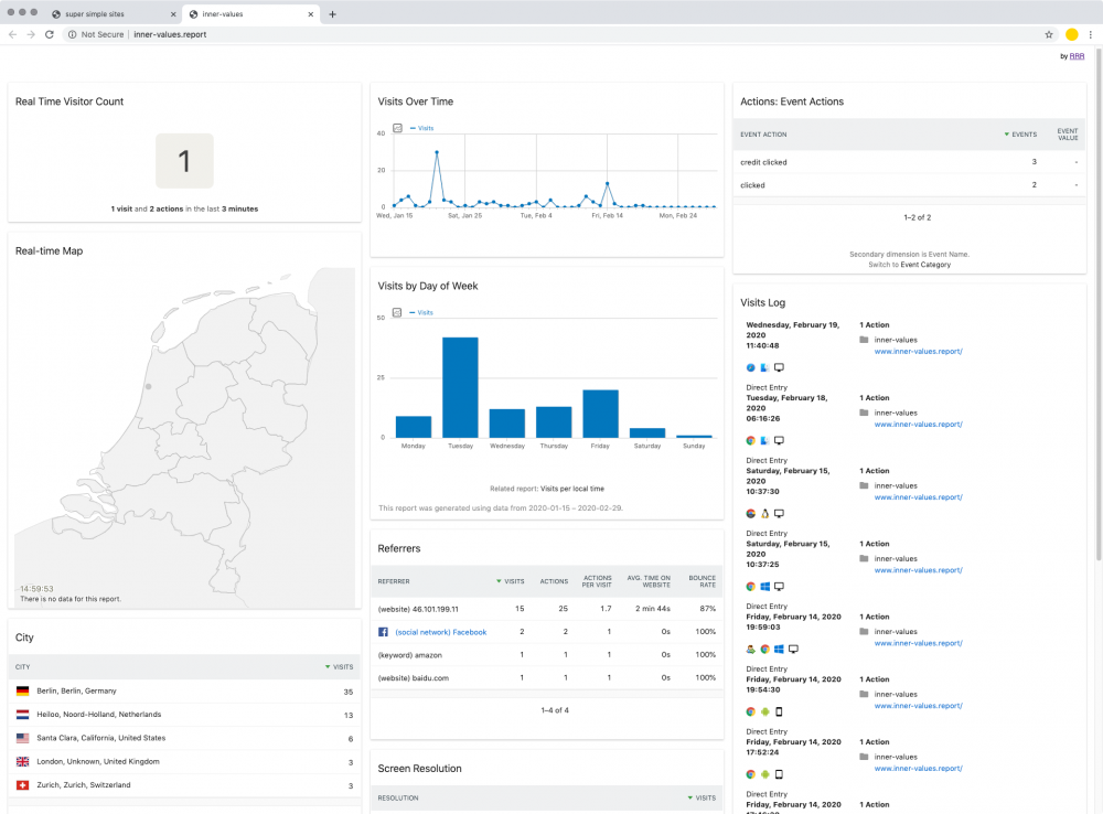
http://inner-values.report/ – a website that is just its analytics report
I call this a non-website, in that it plays with the idea of entirely removing the representational content layer of a website, which lets the visitor see right through the surface at what is behind – namely it's metrics and collected data.
———
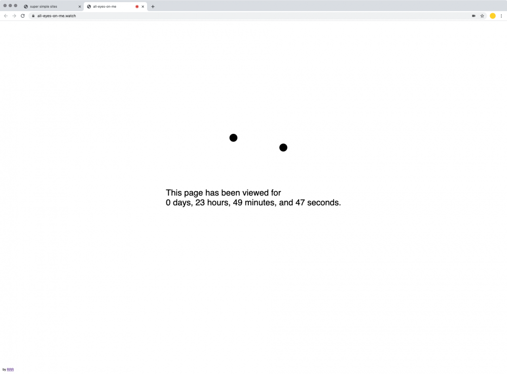
https://all-eyes-on-me.watch/ – a websites that keeps eye contact with you"
Question: Does a website exist if no one looks at it? this one keeps track of how long visitors have viewed it – and by doing so, it legitimizes its own existence.
———
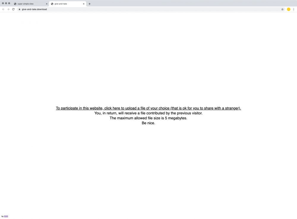
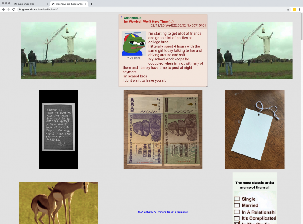
https://give-and-take.download/ – a website that lets you leave something behind for the next person
This site acts as proxy between past and future visitors. it asks the user to upload a file, who then – in return – receives the previously uploaded 'mystery file'. It touches on the topic of trust and anonymity on the web, was well as the question 'What you are willing to share publicly?'. It's also a bit of a social experiment, as it remains to be seen, if people are going to be nice and share useful things or not.
———
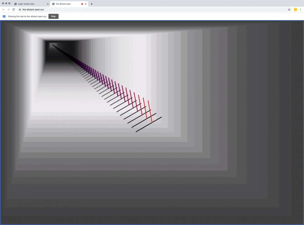
https://the-distant-past.xyz/ – a website that is all its past versions
This one is a bit more poetic and can be seen as a web-based sculpture. a site, that is itself, that is itself, that is itself...
at the same time it is also a little nod to the tradition of having a clock on your website.
